Summer Project - Making my Etsy shop more searchable

It has been a busy summer and I am afraid I have neglected my readers! Back in early June I discovered a site called Etsy Ranks which connects to Etsy and gives you all sorts of useful information to help you improve your shop and search potential. It pointed out simple things like spelling errors as well as more complex things such as whether you are using enough of the given characters in your title and if you are using your tags efficiently in the first paragraph of your description. It was a real eye opener for me and even though I found for the most part that my shop was ranking high, it made me take a closer look and I was astonished to find that some of my listings which hadn't been edited in years, frankly, had terrible titles, descriptions and tags. So I rolled up my sleeves and went through the Curious Portraits shop listing by listing which took me the better part of the summer.

I thought it might be a good idea to take a look at the listings of other successful sellers whom I admire and let them guide me in making my own items more marketable.  I began with my titles which are the most important searchable part of a listing and tried to think like a buyer and what terms they would likely use to search for an item. For example I changed the title Spiritualist Fox Brooch to Fox Portrait Brooch, Fox Pin, Victorian Fox, Oval, Spiritualist Fox, Gothic, Steampunk, Halloween. By doing so I was listing all the information in order of importance as well as keeping it clear and descriptive. Next I tackled the item descriptions and tried to clearly describe the item as well as suggesting ways it could be used and who it might appeal to. My original descriptions, albeit charming, were more like stories and were lacking in searchable keywords. I also made sure all my related products were shown in the photos and had proper links. Last but not least I up-dated all the keywords, making them more specific and adding in style tags such as Gothic, Victorian and Steampunk if appropriate. This was indeed a formidable task but one that clearly needed to be done and in plenty of time for the busy Christmas season. I am happy to say not only are hits to my shop steadily increasing but sales as well! Below are some of the new items I've recently added to the shop.

New Victorian Animal Notebooks feature an allover print using my favorite portraits.

New Victorian Animal Notebooks feature an allover print using my favorite portraits.

For the new 2017 calendar I up-dated the look using new animal portraits and put the dates in a grid which many of you requested for the 2016 calendar.

For the new 2017 calendar I up-dated the look using new animal portraits and put the dates in a grid which many of you requested for the 2016 calendar.

New Victorian Writer Portrait Notecards featuring Arthur Conan Doyle, Edgar Allen Poe and Jules Verne, three of my favorites.

New Victorian Writer Portrait Notecards featuring Arthur Conan Doyle, Edgar Allen Poe and Jules Verne, three of my favorites.

New Victorian Animal Necklaces.

New Victorian Animal Necklaces.

New Dog Adventurer Notecards just in time for Halloween.

New Dog Adventurer Notecards just in time for Halloween.

Don't forget to follow me on Instagram @lisa.zador  and Facebook for daily up-dates!

The Frog Prince

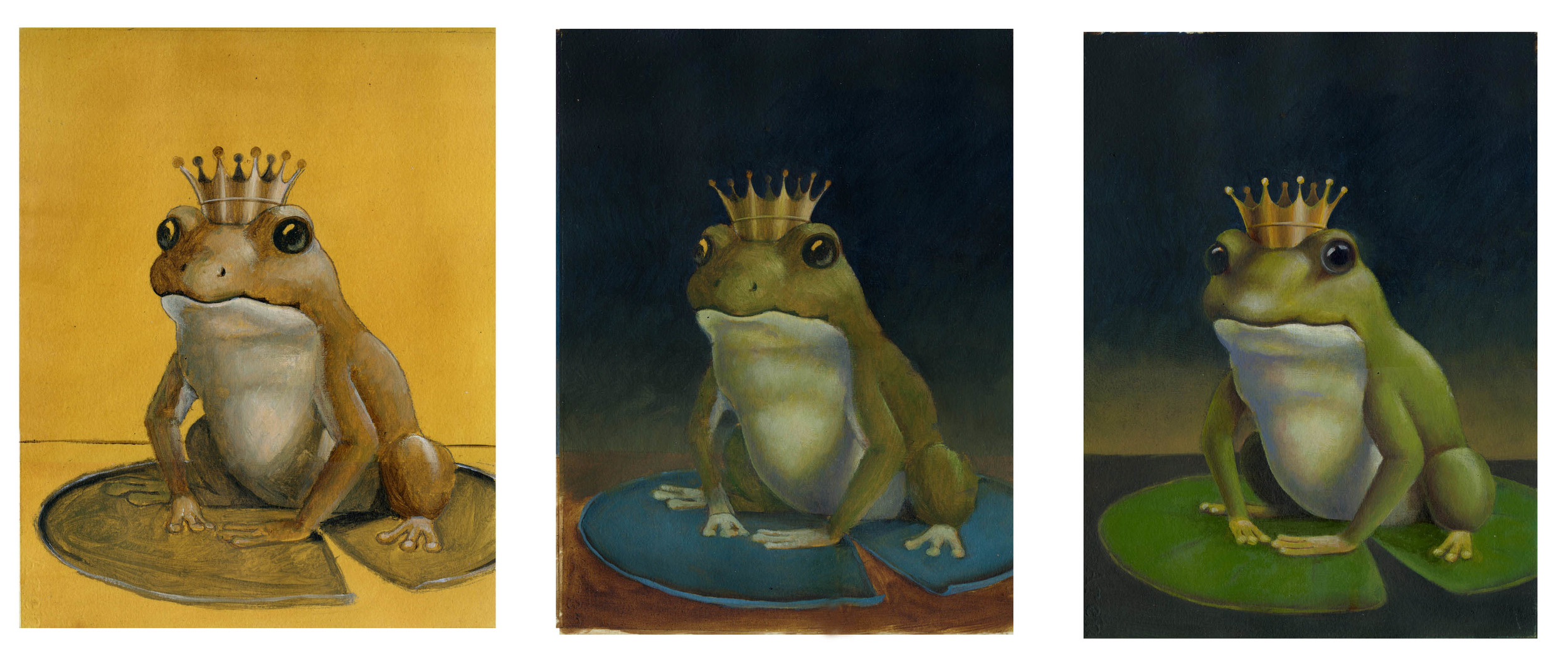
I never tire of Grimm's fairy tales and have always found The Frog Prince. particularly charming. It was somewhat challenging to portray a slimy, bumpy frog as a friendly and approachable character without making him too cartoon-like. I've been preoccupied with night time skies lately and thought the stars and the fireflies would bring an element of mystery and serenity to his portrait. Below are some of the stages of the painting beginning with the sepia under painting.

The Frog Prince final painting

The Frog Prince final painting

The Frog Prince stages of painting

Cheesy Portraits - Dairy Farm Animals

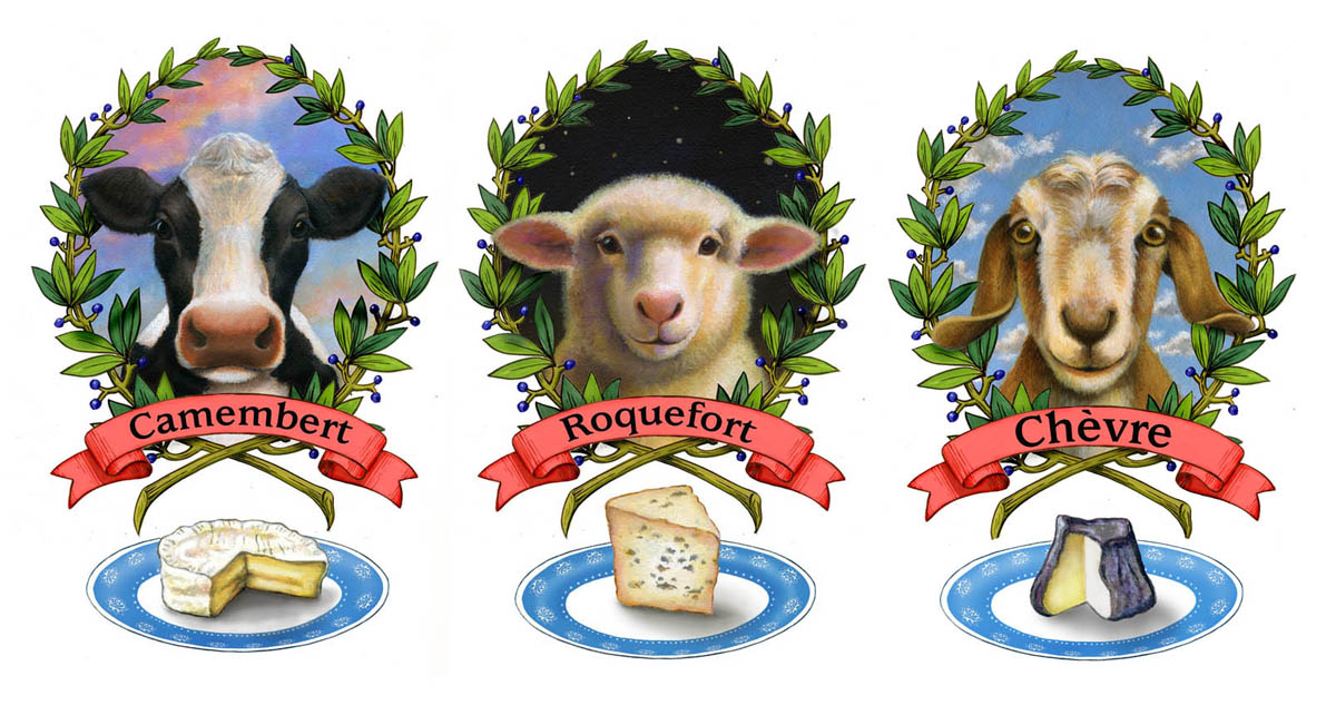
The idea of painting a series of farm animals has been in the back of my mind since I visited Fox Hollow Farm while working on their wine label and met so many beautiful animals. A few weeks ago I was enjoying a particularly creamy and delicious camembert when the idea of combining my love of cheese with the farm portraits came to mind. After some research I settled on 3 of my favorite cheeses made from the milk of a cow, a sheep and a goat.

The three finished dairy animals complete with their own special cheeses.

The three finished dairy animals complete with their own special cheeses.

I painted the animals as individual portraits first. I then created the laurel wreath, the banner and the cheeses on the plates separately and put them all together in Photoshop for the final artwork.

The three original dairy animal portraits without their laurel wreath frames.

The three original dairy animal portraits without their laurel wreath frames.

I wanted them all to have a different sky. From the beginning I knew that the sheep should be on a night time sky, given the association of counting sheep, and the deep blue ground would set the white of his wool off nicely. The goat had such a cheery face that I thought he should be set against a clear blue sky with fluffy white clouds and the cow reminded me of early morning milk for my coffee and cereal so he is pictured with a colorful dawn sky.

The original sketches before I worked out the laurel wreath frames.

The original sketches before I worked out the laurel wreath frames.

I toyed with the idea of putting each cheese on a differently patterned plate, mostly because I have a passion for mismatched vintage china, but in the end I thought keeping the plate, wreath and banner consistent in all three tied them all together as a set. The portraits are all available as prints with or without the frames and cheeses in my Etsy shop Curious Portraits.

The Writer's Chronicle Cover Illustration


My most recent project for The Writer’s Chronicle was an open ended assignment which was both a challenging and satisfying puzzle to solve.

The cover illustration was for an essay about the Pulitzer Prize winning novel A Visit from the Goon Squad by Jennifer Egan which focused on the structure of the book: the way the chapters stand on their own as well as making up a larger story while moving back and forth through time.

I began by jotting down ideas as I read: time passing, relationships and looking back, for example. The theme of time stood out to me so I knew I wanted a clock face to feature. Another strong element was the way the individual chapters functioned as cells in a comic strip, or frames in a strip of film. After some experimentation I decided that to convey the feeling of nostalgia the piece evoked in me, I would represent time by creating a clock themed background wallpaper that had a vintage feel and over lay framed images that when seen together, created one larger image.  I put this together digitally for the concept sketch using stock clock faces and sketched frames but for the final I hand painted the clock faces and the frames and layered them in Photoshop. The only change we made was to brighten the sepia toned palette of the sketch. I chose a soft color story inspired by vintage wallpaper.  I love projects like this that stretch my imagination and give me total freedom to experiment.

The-Writers-Chronicle-Jennifer-Egan
Writers-Chronicle-Sketches

Fox Hollow Vineyard Wine Label

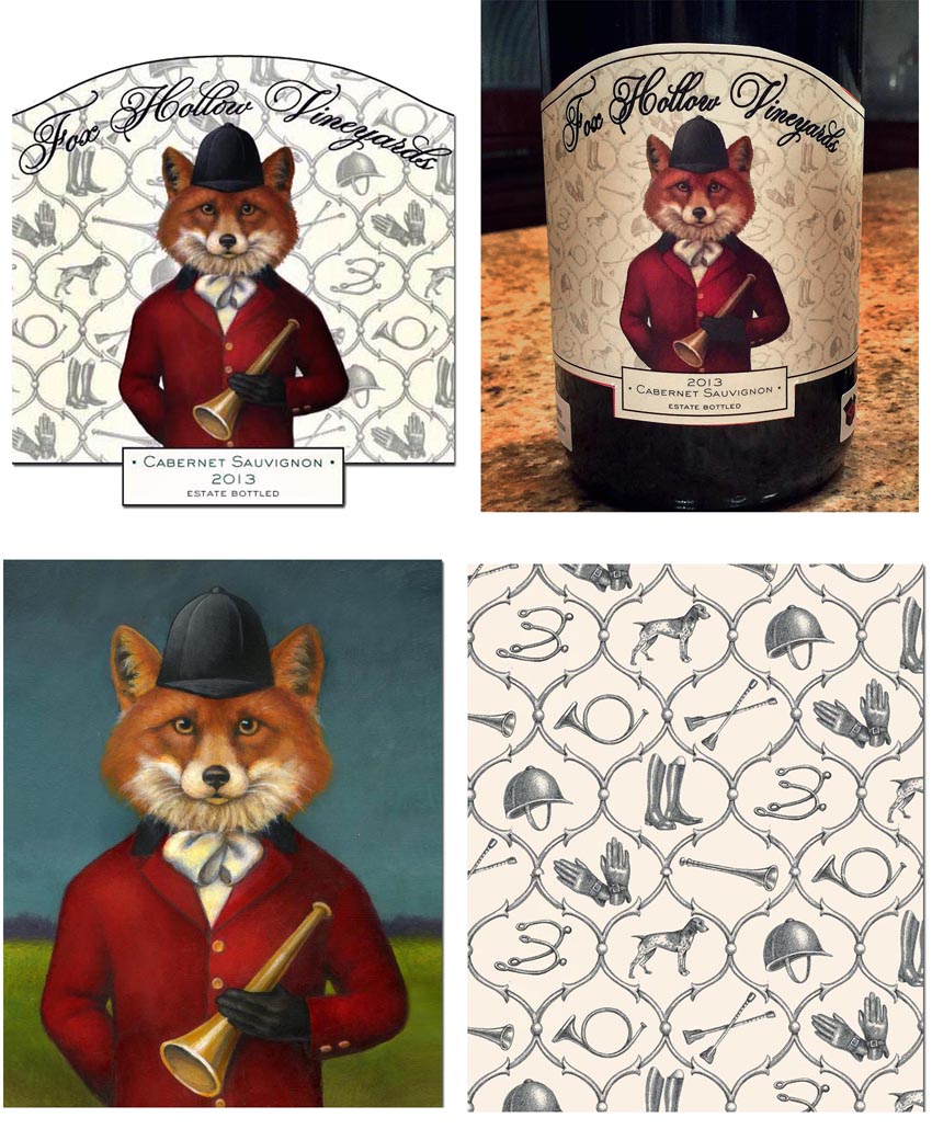
I truly enjoyed creating this label for The Fox Hollow Vineyards. They first approached me about creating the perfect fox to use as their brand. He had to be regal yet friendly. Their vineyard used to be fox hunting land and I thought it would be a humorous choice to put him in full fox hunt garb.

We knew from the beginning that he should be seen straight on; however, in the early sketches,  I experimented with various shaped horns and hand positions until we found the perfect combination.They suggested we use a landscape as the background which I created in the original painting but then thought it would be fun to use a fox hunt themed pattern instead.I jumped at the chance and created a tonal print in black pencil to keep it soft so that when the fox image was added in Photoshop, it would stand out nicely.

They loved the pattern so much that they asked me to design a tablecloth and coordinating napkins to be used for their first wine tasting.


The Finished Label - The original painting - The fox hunt pattern

The Finished Label - The original painting - The fox hunt pattern

Early Sketches

Early Sketches


A Brief Tribute to a Beloved Idol

The death last week of David Bowie has brought up the past in such a stunning and unexpected way that I felt I needed to write a few lines about how he influenced and inspired me throughout my life. It began when I was a teenager watching his ground breaking performances with my sister on The Midnight Special and evolving through my college years during which he was recording my most treasured albums: Low, Heroes and Lodger not to mention the 2 albums he made with Iggy Pop, The Idiot and Lust for Life. I was just starting my artistic journey and these masterpieces could not have come at a more important time. They were like nothing I had ever heard and their mere existence helped me to stretch my imagination and believe in the infinite possibilities of the creative mind. He led me to discover the genius of Brian Eno and his Oblique Strategies, a set of cards with various sayings intended to help one get over a creative block.  I learned of The Exquisite Corpse which is a collaborative means of composing music and artwork introduced by the Surrealists , not to mention the magical theatrics of Klaus Nomi and Joey Arias. I can't possibly record nor even remember the many ways he has contributed to my education and fed my thirst for knowledge. His music has been a constant part of my life and he will be so dearly missed. 

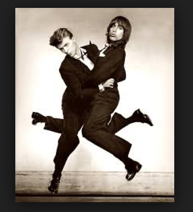
One of my favorite photos of Bowie with Iggy Pop mimicking the antics of Dean Martin and Jerry Lewis.

One of my favorite photos of Bowie with Iggy Pop mimicking the antics of Dean Martin and Jerry Lewis.

Bowie and Tilda Swinton switching roles.

Bowie and Tilda Swinton switching roles.


The Mouse King

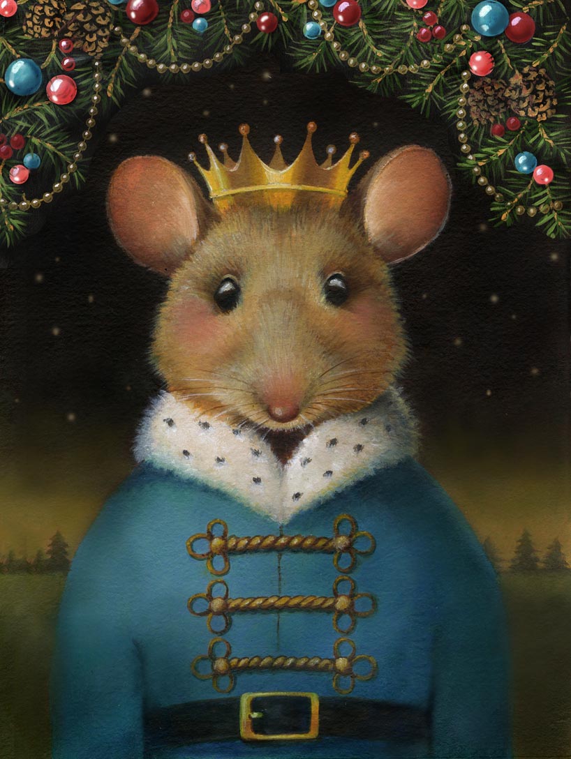
Every year I do paint a special portrait for Christmas and use it as my Christmas card. I have been wanting to do another mouse portrait and the idea of painting the Mouse King came to me while watching the Battle of the Nutcrackers on Ovation. Anyone familiar with that ballet and story knows that the Mouse King is not the most likable character so my Mouse King is more a representation of the wise and benevolent leader I imagine the character could be.

The Mouse King - final portrait.

The Mouse King - final portrait.

This portrait began very differently and even though at the time I was pleased with the sketches, I found myself hesitating to begin the actual painting. I know my own process fairly well and tried to trust that I was resisting it for a reason and let the sketches sit for about 2 weeks. Finally I figured out that what was bothering me was that I wanted this mouse to be more realistic and expressive then he was in these initial sketches which seemed too stylized and simplistic.

First sketches for the Mouse King

First sketches for the Mouse King

So I sat down with it once again and tried using just his head and shoulders and knew right away that I was on the right track. It is always difficult to change direction once you are set on a particular sketch but I've learned that moving forward on an idea that I am not fully committed to usually leads to a mediocre piece at best.

The Mouse King Final Sketches

The Mouse King Final Sketches

I had originally intended to put a swag of garland behind him but I was so happy with the peaceful night time feel of the portrait that I decided to paint the garland separately and use it for the Christmas card but keep the portrait itself simple. I offer it both ways in my Etsy shop Curious Portraits.

The Mouse King with the garland.

The Mouse King with the garland.

An analysis of Pet Santas - Bingos 2015 photo with Santa

It is the time of year where I bathe and primp my dog Bingo and cart him off to the local pet store for his annual photograph with Santa. All in all I am pleased with this year's photo as Bingo looks very puppy-like for his 15 years. But the Santa, as kind as he was, had on the most bizarre outfit. I understand that these are the B-level Santas that are available for pet stores, probably just a youthful employee.  I must however ask, where do they find these outfits? The way the moustache is attached to the hat creates a bizarre Ancient Aliens type of helmet. Do they really think that dogs won't recognize these imitation Santas? I seemed to remember that the earlier photos had much more realistic outfits so when I got home I thought I'd pull out his past photos for comparison and decided to make up this chart. (You can read more about the Maniacal Dog Mother of 2013 here.)

Pet Santa Comparison Chart

All that being said, I am grateful that pet stores provide a Santa at all and must admit that they have always been very kind and gentle with my dog.  I truly enjoy this tradition but I must admit that tomorrow I am heading over to Bergdorf Goodman to have Bingo photographed with the REAL Santa...

Bingo with the REAL Santa

Bingo with the REAL Santa

Bingo and Myself with the Bergdorf Goodman Santa

Bingo and Myself with the Bergdorf Goodman Santa

RSS Block
Select a Blog Page to create an RSS feed link. Learn more

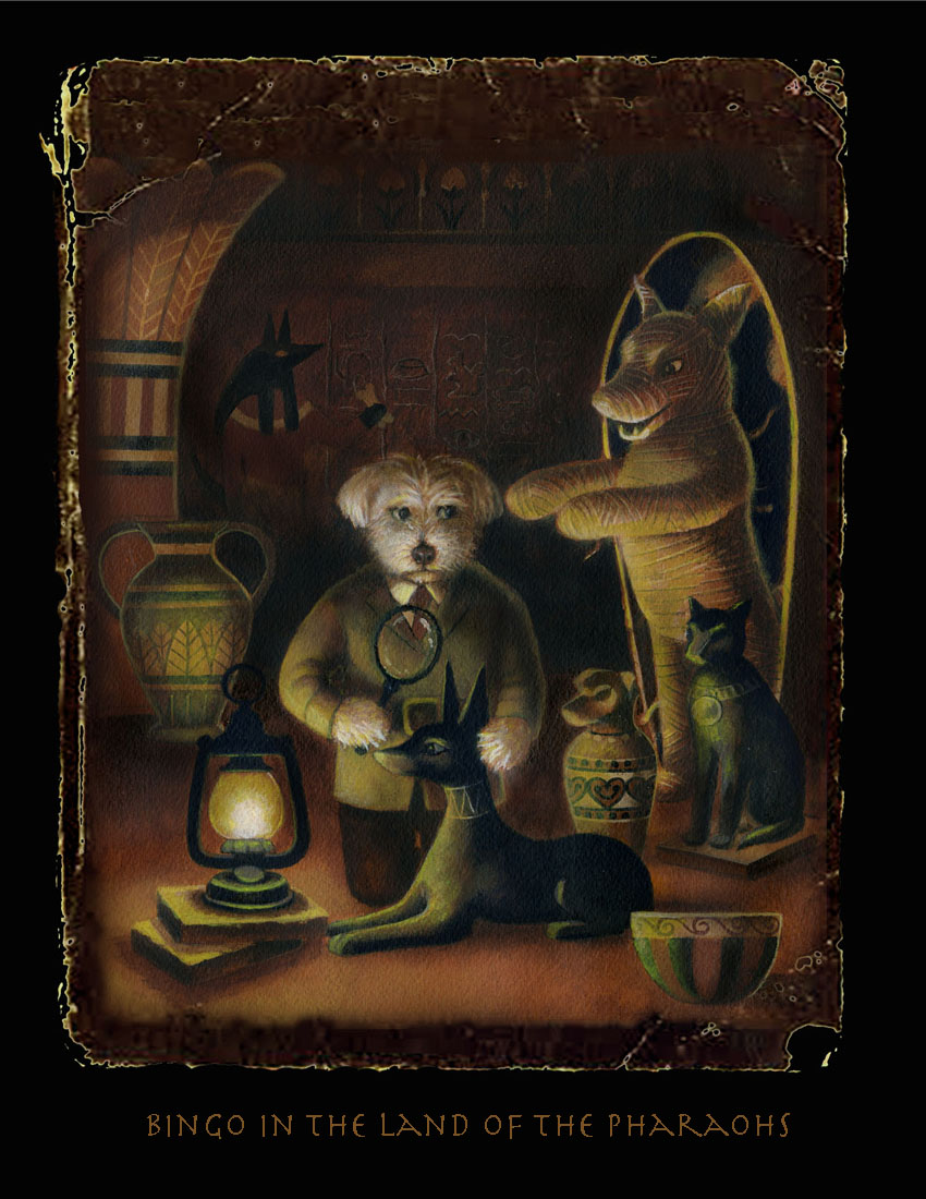
Bingo in the Land of the Pharaohs

My favorite week of the year is here and it involves sending out my annual Halloween card featuring my long suffering dog Bingo in some form of mortal danger. Each year I agonize over it; second guessing myself, re-sketching, re-painting, changing it at the last minute up until the 11th hour. I always think I am so behind schedule until I look at the date the card went out the previous year and am surprised to see it is always sent at the last minute.

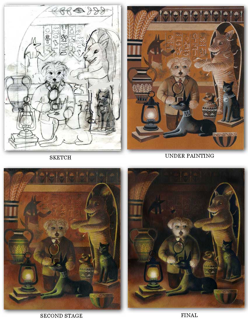
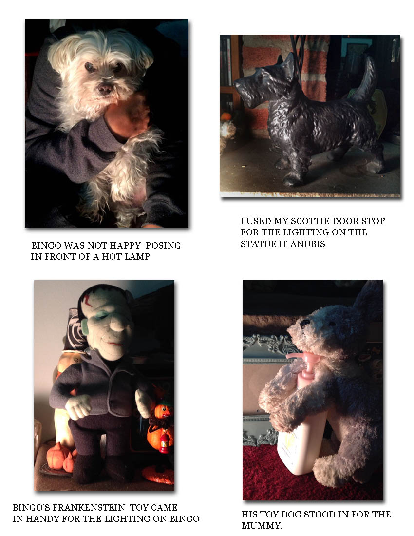
This year I decided to change it up a bit and go back to the sepia toned look of "Ghost Stories for Dogs" and "Sleepy Hollow". It was a tough decision because I was so happy with the 1950's sci fi look of the previous 2 years "Outer Space Bingo" and "Deep Sea Bingo". I originally got it into my head that Bingo as a mummy would be funny. That evolved however into Bingo playing the role of Howard Carter and being the one who discovers the mysterious dog mummy. I really wanted to stress the darkness of a tomb and show everything lit by lantern light which was no small challenge. Poor Bingo had to pose standing upright above a spot light while my friend took photos. I also posed one of his dog toys propped up with its arms out to see how the light might fall onto a dog mummy, if one actually existed. In the end it was the light source that made the whole thing work. I even had to let go of all the hieroglyphics and cave paintings I had put into the background when I knew it had to be inky dark to make the action going on in the foreground stand out. When I thought I was finished and ready to lay the card out, I had the idea to make it look like an old torn photo in order to stress the vintage over all feel. I found some old book reference on-line and fiddled with it in Photoshop until I came up with the finished product.

Here is the progression of the painting.

Here is the progression of the painting.

It is always so hard to keep the finished image in my mind as it goes through the various stages from sketch to finish.

Sometimes I have to get creative when trying to imagine something that doesn't actually exist and it comes in handy being a collector of eclectic objects to use as stand ins!  Prints of Bingo in the Land of the Pharaohs are available for sale in my Etsy shop Curious Portraits.

Curious and Creepy!

Are you feeling an eerie chill running up your spine? Perhaps a vague sense of foreboding? Don't worry, it's only Halloween creeping up on you! Here are some of my favorite curious and creepy portraits to help you get into the Halloween spirit...

Headless Dogs, Gentlemen Skeletons and even Edgar Allen Poe makes an appearance!

Headless Dogs, Gentlemen Skeletons and even Edgar Allen Poe makes an appearance!

We have been busy preparing our new Black Beaded Portrait Miniatures too. They add a nice touch of Victorian gloom to any wall. You can read about the history of these Portrait Miniatures and how they inspired me in this earlier blog post.

Any image in the shop can be customized into a beaded Portrait Miniature.

Any image in the shop can be customized into a beaded Portrait Miniature.

Don't forget to follow us on Instagram for works in progress and upcoming items.

Happy Haunting!

October Curiosities

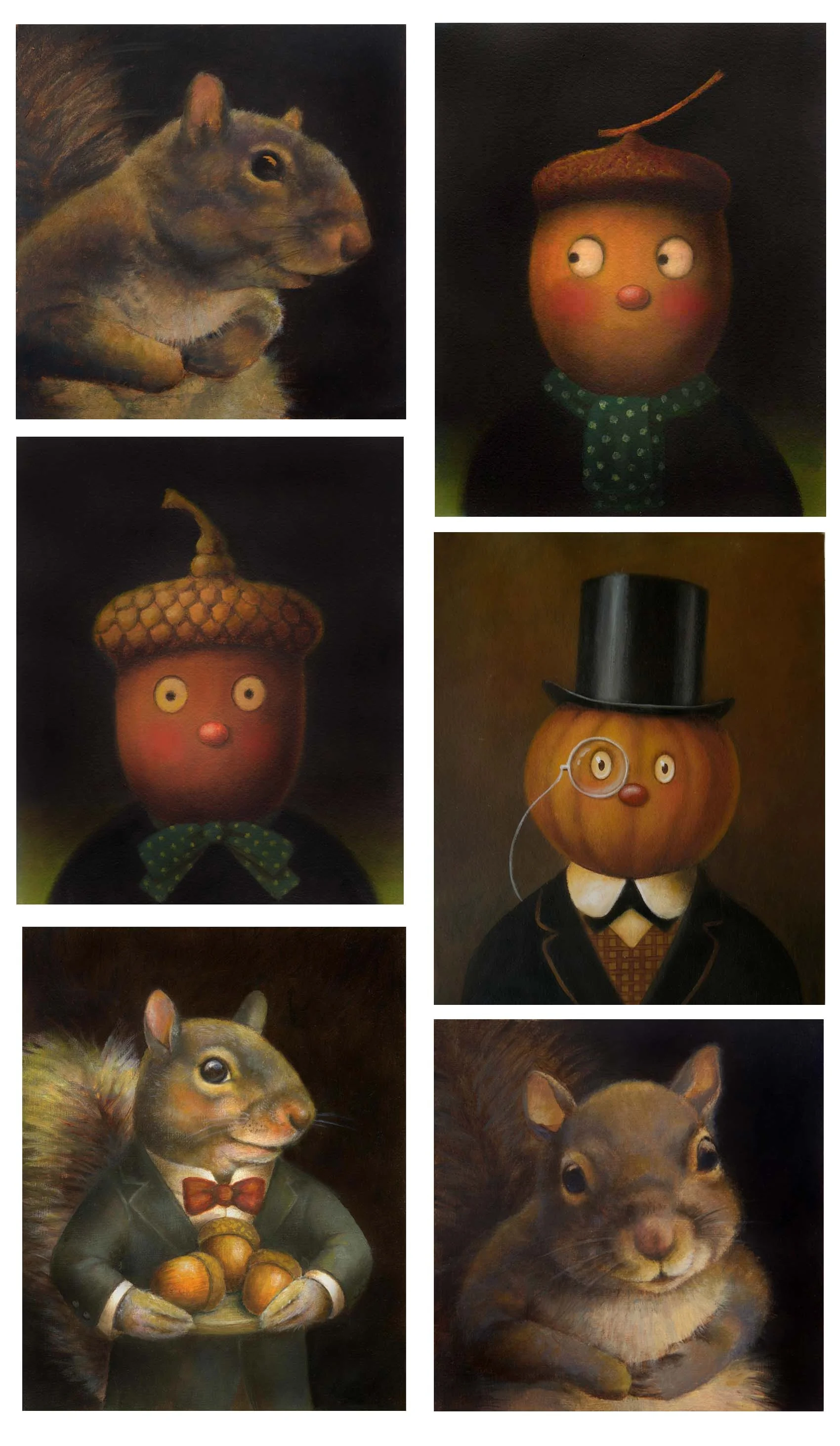
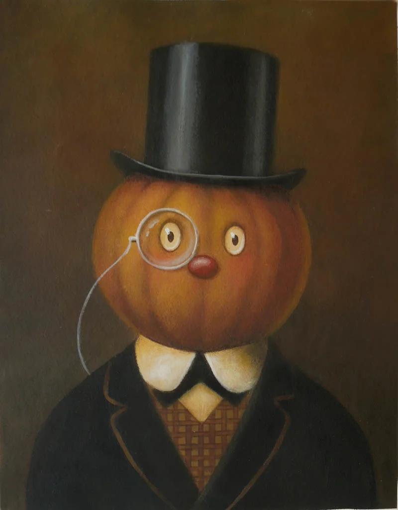
October is here bringing not only crisp, chilly air and falling leaves but some of my favorite autumn characters such as Pumpkin Gentlemen, Acorn Men and Squirrels! My shop assistant Bingo and I are busy preparing for the Halloween season (our favorite time of year!)

Bingo star-glasses-sml.jpg

Don't forget you can also follow us on Instagram for daily posts, works in progress and check out current inspiration and favorites on our Pinterest boards!

Giving the Etsy Shop a Facelift

I noticed this week that Etsy changed their home page layout a bit by adding a shop image and a photo of the shop owner. That inspired me to take a fresh look at the overall branding of my shop Curious Portraits which I have changed several times over the five years it has been open and I thought it was due once again for a facelift. I thought it would be nice to emphasize the Victorian theme of the portraits themselves and put the images inside black decorative frames. I can still change the images within the frames for the holidays or when I want to promote a particular new portrait. For now I went back to my sepia toned Cat Dandy which I still feel is still representative of the shop as a whole. I added in a black border that reminds me of old fashioned visiting cards and mourning stationary.  I still love the mixture of script and regular type but I thought the title needed to be bolder and the rest of the text sans serif to make it slightly more readable at a small scale.

For the banner I added a soft grey ground to stand out a bit against the white page but for the bio card, which accompanies each sale, the shipping label and the business card I thought a white ground kept it more legible.

Below shows the old branding. I'd love to know if you think it was an improvement!

Curious Portraits by Lisa Zador-old branding


A Gentleman Fox for Fox Hollow Vineyards

I've just finished working on one of my favorite projects; designing a wine label for Fox Hollow Vineyards. Joe Casola and Kim Casola hired me back in December to paint a handsome and gentlemanly fox for the labels of their new wines premiering in the autumn. They were so wonderful to work with and their beautiful farm was truly an inspiration.  We began with a formal portrait of a gentlemanly fox with a landscape background representing their farm.

Fox Hunt Portrait by Lisa Zador

Once the portrait was completed Joe had the idea of isolating the fox from the background and putting some sort of pattern behind him. With all of my textile design background and love of repeating pattern, I jumped at the chance to design a fox hunting themed pattern. We wanted to keep it soft and neutral to sit nicely in the back so I drew the elements in black pencil instead of painting them in gouache as I normally would.

Fox Hunt Pattern by Lisa Zador
Fox Hollow Label Detail by Lisa Zador

We don't yet have the printed labels but Joe mocked up some sample bottles just to see how it will look! I did a blog post back in March about the design process including sketches and preliminary drawings which you can read by clicking here.

Fox Hollow Wine Labels Lisa Zador

Curious Mood Boards

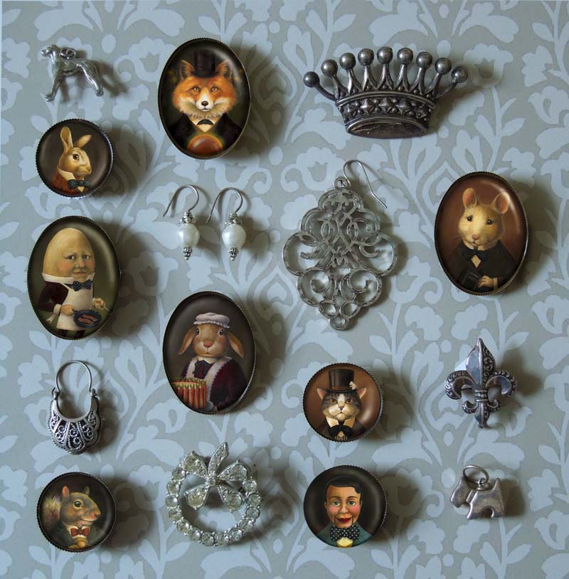
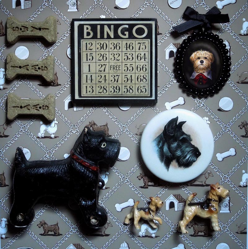
I have been busy this summer freshening up my Etsy shop Curious Portraits in preparation for the holiday season. I make a habit of reviewing the product shots in the shop from time to time which I find has a similar effect of re-arranging the art on the walls. It makes everything look new! I have been very inspired by the many beautiful Mood Boards I see on Instagram and have discovered how much I love putting together cherished, vintage objects from my collection.  The result of all this is an on-going project of styling some of the items from my shop in with the vintage collectibles. They make a pleasing display and a gentle advertisement all in one!

Animal Portrait Brooches from www.CuriousPortraits.Etsy.com

Animal Portrait Brooches from www.CuriousPortraits.Etsy.com

This is the latest in the series featuring some of my favorite vintage jewelry arranged with my Animal Portrait Brooches. I often use my own textile designs printed out as the background, this is one of my original damask stripes.

Lisa-Zador-Portrait-Miniatures

I thought that some of my vintage buttons and notions made a pleasing display when arranged with some of my Victorian inspired Portrait Miniatures. (You can read more about the inspiration and making of these here)

I used one of my favorite vintage alarm clocks in this one along with a few writing notions. I thought the soft grey of my Daisy the Squirrel Portrait Miniature complimented the color scheme.

Bingo-Mood-Board-sml.jpg

My dog Bingo also got his paws into it and created this one featuring his own portrait miniature with one of my original dog themed textile designs in the background!

Pinocchio

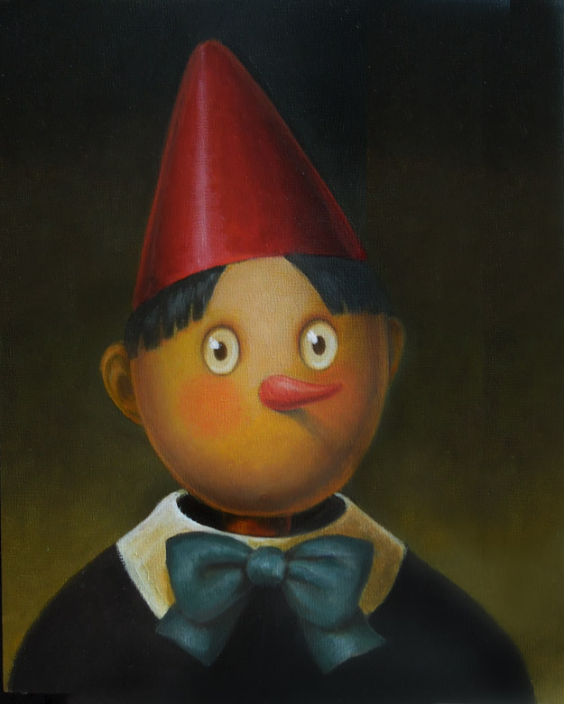
About a year ago I had an inspiring meeting with the wonderful editors at Skyhorse Publishing. It was so refreshing to meet with people in the publishing industry who are so enthusiastic about what they do. We discussed enthusiastically our favorite children's books and illustrators from classics to contemporary. This experience made me think a lot about my own favorite stories, how they affected me and also how I would approach illustrating a book; a task that I admit seemed overwhelming at the time. One book that I have recently discovered is Pinocchio. My most recent visit to Florence coincided with the anniversary of the publication of the book by Collodi and I picked up a copy in italian. I had previously only been familiar with the Disney version and was surprised to find not only how dark the original story was but also how many colorful animal characters it involved. From the Rabbit Undertakers to the Poodle Footman not to mention the Cricket Ghost plus a menagerie of dogs, cats, a snail, squirrel, owl. I realized it presented the perfect challenge for my first series of book illustrations. Here are the first finished drawings and painting, I'll be adding more as I go along.

Pinocchio-illustration-Lisa-Zador

First I had to work out what Pinocchio would look like. I thought he should be simple since he was a puppet carved out of a piece of wood. Even though he is quite mischievous in the story I also wanted to portray his innocent and trusting nature.

Pinocchio-Tree-Trunk-Lisa-Zador

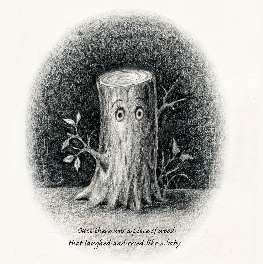
This is a drawing of the piece of wood Geppetto finds that originally inspires him to create a puppet. I wanted to create a number of the images in black and white since most books require both black and white and color illustrations. It was a challenge for me but I wanted the drawings to look purposeful and not simply black and white versions of otherwise color images. I have always loved using Kohinoor Negro leads and pencils which are unfortunately no longer made. They create such a rich, velvety black when I use them on Stonehenge printmaking paper!

Pinocchio-Rabbits-Lisa-Zador

The scene where Pinocchio is sick in bed is one of my favorites as it is filled with interesting characters. These are the Rabbit Undertakers that appear carrying a small coffin to frighten Pinocchio into taking his medicine. It was only after I had finished it that in reading over the Italian text I realized there were supposed to be four rabbits, black as ink! Well I suppose I could get away with dressing them is black but if I ever put this into print I'm afraid I will have to re-do this one!


Dark and Moody

I have been painting my apartment over the past few weeks which has involved emptying out storage spaces and re-discovering artwork from the past. This group of paintings is from a period of my work that I am particularly fond of. These interiors and landscapes were painted at a painful time in my life coming at the end of a series of personal losses. As haunting as they now seem, at the time they were a source of great comfort to me, depicting places in which I had been tremendously happy.  Several of them such as the Scottish landscapes and the spiral staircase have been hanging on my walls framed for years and remain truly close to my heart. Some of the smaller ones however had been in storage and I have been so happy to pull them out and hang them along with the others. Each one is like a visual diary entry and has been part of a fascinating journey for me through the past. 

This is one of a series of many drawings and paintings of staircases that continued over the course of nearly a decade.

This is one of a series of many drawings and paintings of staircases that continued over the course of nearly a decade.

This staircase is from the building in which I lived when I was an au pair in Versailles, one of the happiest times of my life.

This staircase is from the building in which I lived when I was an au pair in Versailles, one of the happiest times of my life.

This is one of many landscapes I did of Glen Coe on a wonderful road trip through Scotland.

This is one of many landscapes I did of Glen Coe on a wonderful road trip through Scotland.

This is also of Glen Coe, one of the moodiest and breathtakingly beautiful places I have ever traveled through.

This is also of Glen Coe, one of the moodiest and breathtakingly beautiful places I have ever traveled through.

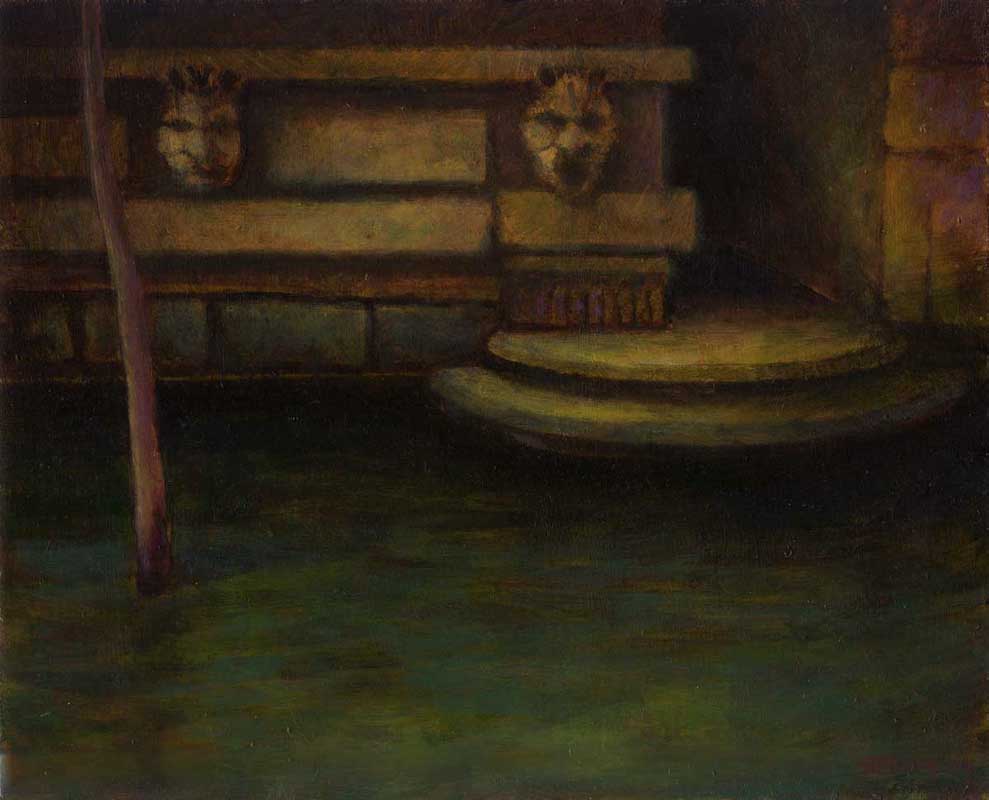
This is one of a series of painting I did during one of my visits to Venice, which remains for me the Queen of all cities.

This is one of a series of painting I did during one of my visits to Venice, which remains for me the Queen of all cities.

I have endless sketches and photographs of the canals in Venice. Their dark, mysterious depths fill me with wonder.

I have endless sketches and photographs of the canals in Venice. Their dark, mysterious depths fill me with wonder.

I particularly like the stairs along the Venetian canals that seem to lead nowhere when the tide is low.

I particularly like the stairs along the Venetian canals that seem to lead nowhere when the tide is low.

The worn, architectural details are everywhere.

The worn, architectural details are everywhere.

Who can resist these gateways into darkness and mystery?

Who can resist these gateways into darkness and mystery?

Favorite 19th Century Authors - Jules Verne

In this series of paintings I am paying homage to some of my favorite writers from the 19th century. The first in the series was Edgar Allen Poe whose chilling words continue to thrill me today as much as they did when I first read them years ago. (The story behind his portrait can be read here). The second in the series just had to be Jules Verne. His stories filled my childhood with adventures to far off lands and beyond, firing my imagination and always leaving me wanting more. In this illustration I wanted to touch upon as many elements from his most famous stories as I could reasonably fit into one portrait including From Earth to the Moon, Around the World in 80 Days, Journey to the Center of the Earth, 20,000 Leagues Under the Sea and Five Weeks in a Balloon all of which are still in print. His fantastic vision of imagined space travel, undersea exploration and science in general are so incredible when seen from the viewpoint of the mid 19th century. He truly was the Father of Science Fiction.

Jules-Verne-Portrait-Lisa-Zador

Needlepoint Passion

I have been painting my apartment over the past few weeks and today was dusting off the frames of the many needlepoints as I re-hang them and thought I would write a few words about their making. As luck would have it I also stumbled upon the traditional crosstich patterns of Jacob de Graaf this morning on his website Modern Folk Embroidery which were so inspiring. I have always had a passion for needlework of all kinds. It began with watching my Mother carefully embroidering a set of Deer from a kit which arrived with the images lightly printed in cyan blue and all the colors of floss included. I remember wanting to get my hands on those gorgeous skeins of cotton and do something creative with them even as a small child. I didn't begin doing my own embroidery however until years later when, inspired by an adorable Sailor Dog embroidered pillow in Marie Claire Idées that I did a needlepoint portrait pillow of my dog Toby. Another dog themed sampler in Marie Claire Idées tipped me over the edge forever. Inspired by that design, I began my first sampler which hangs to this day in my hall. (I borrowed heavily from that design as the kit was no longer available but I put in my dog Toby as well as some of my other favorite breeds). It was a visit to my Swedish friend Louise in Paris however that began my love of cross stitch. Her beautiful traditional Redwork samplers made me determined to learn that somewhat intimidating craft. My first efforts were a series of one color dog designs in a traditional folk style. I still love them for their simplicity but I upon close inspection one can find many beginners flaws! I continued designing patterns based on favorite themes such as vintage sewing, anthropomorphic kitchen utensils etc. and am currently finishing up a Christmas Dessert pattern based on the books of the Victorian homemaker Mrs. Beeton .

Toby's portrait pillow

Toby's portrait pillow

Dog Sampler - Lisa Zador
My first cross stitch design

My first cross stitch design

Red Dog Crosstitch - Lisa Zador
Blue Dog Crosstitch - Lisa Zador
My Vintage Sewing Design

My Vintage Sewing Design

My Mourning Dove Pattern. (my favorite bird!)

My Mourning Dove Pattern. (my favorite bird!)

Vintage Seashore Needlepoint inspired by a 1950's tablecloth

Vintage Seashore Needlepoint inspired by a 1950's tablecloth

Vintage Anthropomorphic Kitchen Needlepoint

Vintage Anthropomorphic Kitchen Needlepoint

Inspired by my favorite city

Inspired by my favorite city

Of course I had to do one of New York, my home.

Of course I had to do one of New York, my home.