Sherlock Holmes & Victorian Mystery Writers Prints and Posters

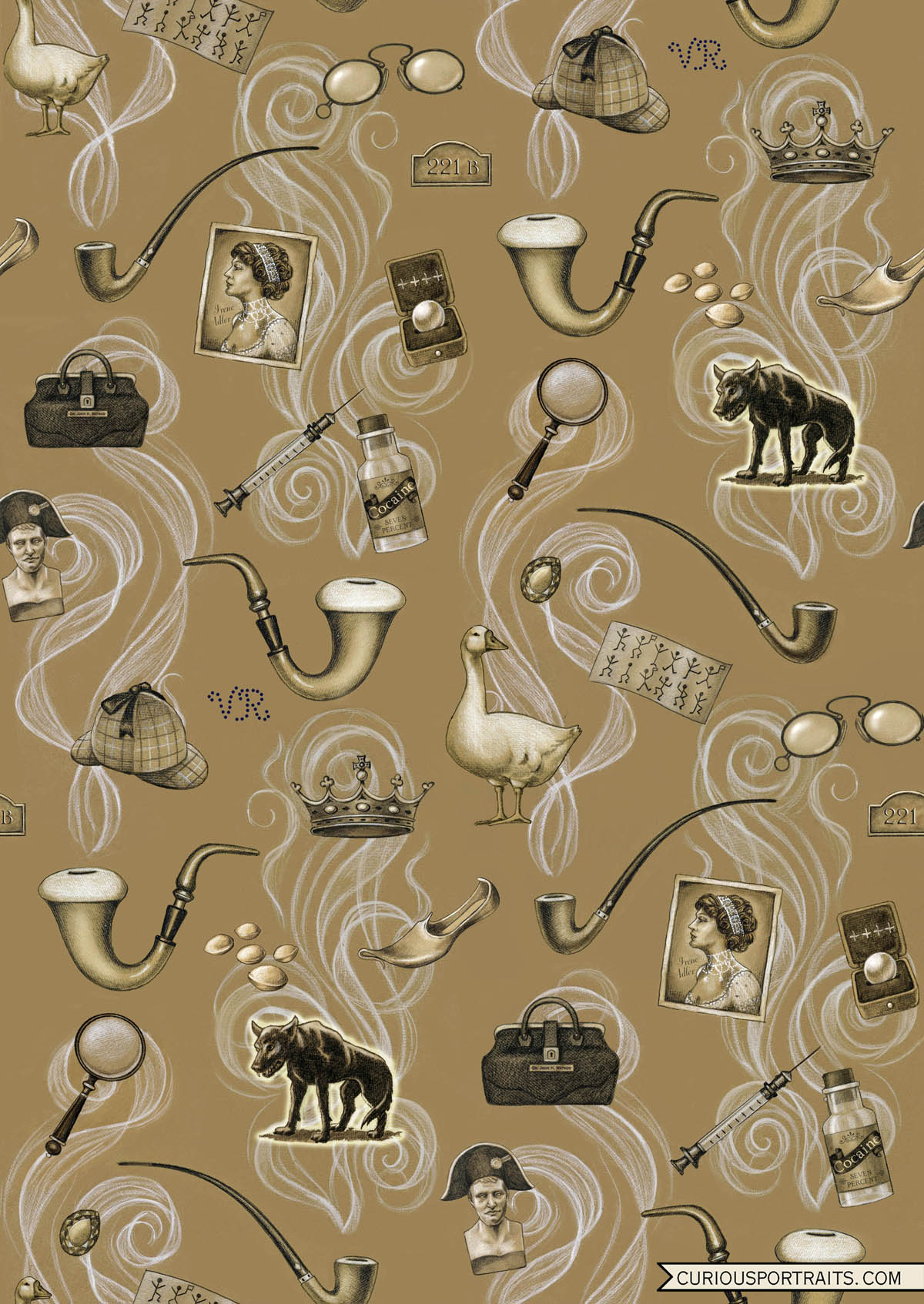
I've been an avid fan of the Sherlock Holmes stories since my older brother first introduced me to them many years ago. They were probably the reason I became so fascinated with Victorian mystery writers and Victorian England in general. I devoured books by Wilke Collins, Sheridan Le Fanu, Mary Elizabeth Braddon, Charles Dickens and of course Edgar Allan Poe (even though he was not British), to mention just a few. Even now I am eager to discover a particularly well written Victorian mystery by a contemporary author such as The Meaning of Night by Michael Cox, Drood by Dan Simmons (a must for any Dickens and Collins fan) or Bellman and Black by Diane Setterfield.  So when I decided to do a line of textile prints based on literary figures I chose Sherlock Holmes as the first. I had already done a portrait of Arthur Conan Doyle in which I used the smoke from his pipe as a design element. That was the starting point for this print along with his iconic Meerschaum Calabash and Churchwarden pipes. I then added in elements representing some of my favorite stories along with general items that any Sherlock Holmes fan would recognize such as his deerstalker cap, 7% solution of cocaine and the VR (Victoria Regina) made of bullet holes on his wall.

Sherlock-Holmes-Allover_Lisa-Zador

Unfortunately I had a very difficult time sourcing a digital fabric printer who could print on chiffon that is thin enough for the ink to bleed through so that it could be used as a scarf. Spoonflower, who is my go-to printer didn't carry anything thin enough so I temporarily had to give up the idea of the scarves. I didn't however want to abandon the idea of the literary prints so my next step was to take the elements and use them in an engineered poster design. I kept the central theme of the pipe smoke and the story elements but put them against a black background to make them stand out and also added in some Victorian fretwork across the top to tie it all together and here is the result:

Sherlock-Homes-Poster-Lisa-Zador

The next step was to create notecards from the print, each displaying a different story and available along with the print at Curious Portraits.
Sherlock Holmes Cards.jpg

Summer Project - Making my Etsy shop more searchable

It has been a busy summer and I am afraid I have neglected my readers! Back in early June I discovered a site called Etsy Ranks which connects to Etsy and gives you all sorts of useful information to help you improve your shop and search potential. It pointed out simple things like spelling errors as well as more complex things such as whether you are using enough of the given characters in your title and if you are using your tags efficiently in the first paragraph of your description. It was a real eye opener for me and even though I found for the most part that my shop was ranking high, it made me take a closer look and I was astonished to find that some of my listings which hadn't been edited in years, frankly, had terrible titles, descriptions and tags. So I rolled up my sleeves and went through the Curious Portraits shop listing by listing which took me the better part of the summer.

I thought it might be a good idea to take a look at the listings of other successful sellers whom I admire and let them guide me in making my own items more marketable.  I began with my titles which are the most important searchable part of a listing and tried to think like a buyer and what terms they would likely use to search for an item. For example I changed the title Spiritualist Fox Brooch to Fox Portrait Brooch, Fox Pin, Victorian Fox, Oval, Spiritualist Fox, Gothic, Steampunk, Halloween. By doing so I was listing all the information in order of importance as well as keeping it clear and descriptive. Next I tackled the item descriptions and tried to clearly describe the item as well as suggesting ways it could be used and who it might appeal to. My original descriptions, albeit charming, were more like stories and were lacking in searchable keywords. I also made sure all my related products were shown in the photos and had proper links. Last but not least I up-dated all the keywords, making them more specific and adding in style tags such as Gothic, Victorian and Steampunk if appropriate. This was indeed a formidable task but one that clearly needed to be done and in plenty of time for the busy Christmas season. I am happy to say not only are hits to my shop steadily increasing but sales as well! Below are some of the new items I've recently added to the shop.

New Victorian Animal Notebooks feature an allover print using my favorite portraits.

New Victorian Animal Notebooks feature an allover print using my favorite portraits.

For the new 2017 calendar I up-dated the look using new animal portraits and put the dates in a grid which many of you requested for the 2016 calendar.

For the new 2017 calendar I up-dated the look using new animal portraits and put the dates in a grid which many of you requested for the 2016 calendar.

New Victorian Writer Portrait Notecards featuring Arthur Conan Doyle, Edgar Allen Poe and Jules Verne, three of my favorites.

New Victorian Writer Portrait Notecards featuring Arthur Conan Doyle, Edgar Allen Poe and Jules Verne, three of my favorites.

New Victorian Animal Necklaces.

New Victorian Animal Necklaces.

New Dog Adventurer Notecards just in time for Halloween.

New Dog Adventurer Notecards just in time for Halloween.

Don't forget to follow me on Instagram @lisa.zador  and Facebook for daily up-dates!

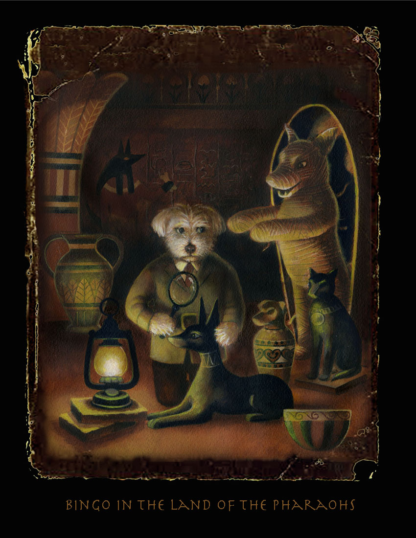
Bingo in the Land of the Pharaohs

My favorite week of the year is here and it involves sending out my annual Halloween card featuring my long suffering dog Bingo in some form of mortal danger. Each year I agonize over it; second guessing myself, re-sketching, re-painting, changing it at the last minute up until the 11th hour. I always think I am so behind schedule until I look at the date the card went out the previous year and am surprised to see it is always sent at the last minute.

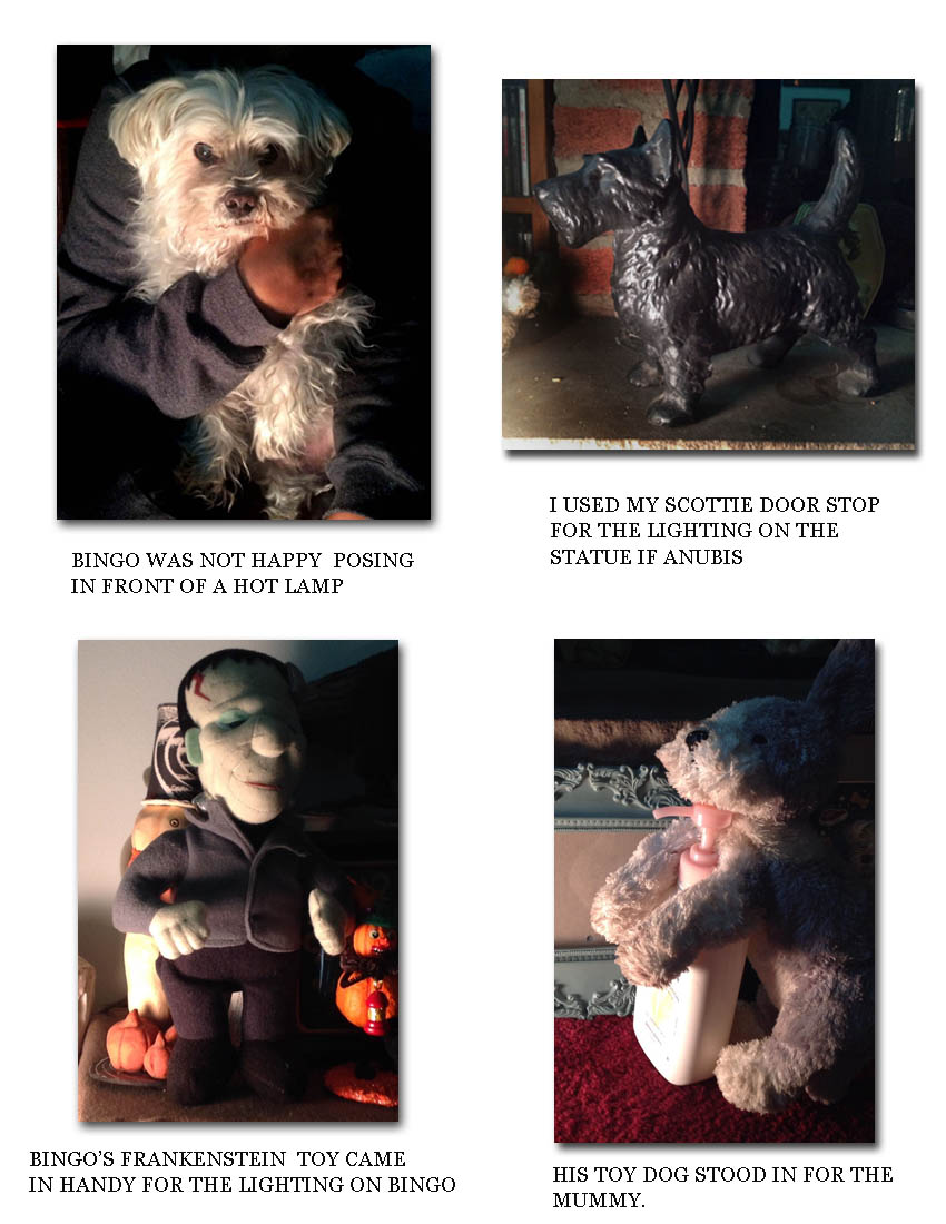
This year I decided to change it up a bit and go back to the sepia toned look of "Ghost Stories for Dogs" and "Sleepy Hollow". It was a tough decision because I was so happy with the 1950's sci fi look of the previous 2 years "Outer Space Bingo" and "Deep Sea Bingo". I originally got it into my head that Bingo as a mummy would be funny. That evolved however into Bingo playing the role of Howard Carter and being the one who discovers the mysterious dog mummy. I really wanted to stress the darkness of a tomb and show everything lit by lantern light which was no small challenge. Poor Bingo had to pose standing upright above a spot light while my friend took photos. I also posed one of his dog toys propped up with its arms out to see how the light might fall onto a dog mummy, if one actually existed. In the end it was the light source that made the whole thing work. I even had to let go of all the hieroglyphics and cave paintings I had put into the background when I knew it had to be inky dark to make the action going on in the foreground stand out. When I thought I was finished and ready to lay the card out, I had the idea to make it look like an old torn photo in order to stress the vintage over all feel. I found some old book reference on-line and fiddled with it in Photoshop until I came up with the finished product.

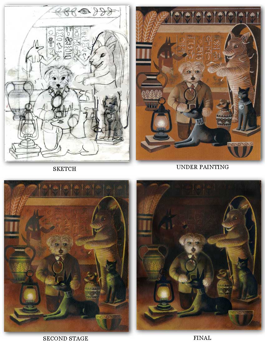
Here is the progression of the painting.

Here is the progression of the painting.

It is always so hard to keep the finished image in my mind as it goes through the various stages from sketch to finish.

Sometimes I have to get creative when trying to imagine something that doesn't actually exist and it comes in handy being a collector of eclectic objects to use as stand ins!  Prints of Bingo in the Land of the Pharaohs are available for sale in my Etsy shop Curious Portraits.

Giving the Etsy Shop a Facelift

I noticed this week that Etsy changed their home page layout a bit by adding a shop image and a photo of the shop owner. That inspired me to take a fresh look at the overall branding of my shop Curious Portraits which I have changed several times over the five years it has been open and I thought it was due once again for a facelift. I thought it would be nice to emphasize the Victorian theme of the portraits themselves and put the images inside black decorative frames. I can still change the images within the frames for the holidays or when I want to promote a particular new portrait. For now I went back to my sepia toned Cat Dandy which I still feel is still representative of the shop as a whole. I added in a black border that reminds me of old fashioned visiting cards and mourning stationary.  I still love the mixture of script and regular type but I thought the title needed to be bolder and the rest of the text sans serif to make it slightly more readable at a small scale.

For the banner I added a soft grey ground to stand out a bit against the white page but for the bio card, which accompanies each sale, the shipping label and the business card I thought a white ground kept it more legible.

Below shows the old branding. I'd love to know if you think it was an improvement!

Curious Portraits by Lisa Zador-old branding


Curiously Portable Portraits

I have been very pleased over the years that my portrait brooches have been so popular in my Etsy shop Curious Portraits.  I have however been asked many times if they were available larger. The original size was 1" in diameter and I have happily found that the bronze settings I use are now available in an oval format of 1 1/4" x 1 5/8" which is absolutely perfect. I really enjoyed setting up a photo template that would be consistent for the series and chose my treasured vintage edition of The Tales of Babar for the background. Since Babar was perhaps the first anthropomorphic animal to win my heart  I thought it would be a fitting tribute. Now you can take your Curious Portraits with you wherever you go! I will be adding more portraits in the shop including all your Halloween and Christmas favorites.

Curiously-Portable-Portraits
The Tales of Babar


Revisting The Well Bred Dog & The Well Bred Cat

I've been busy working on the new website and today realized that I neglected to include my two books, The Well Bred Dog and The Well Bred Cat! I pulled them out to scan and arrange them for presentation and was reminded of that wonderful year when my dear friend James Waller and I were working on them together. It was such an exciting project. Sometimes I would do the painting first and he would come up with a clever biography for the dog or cat and sometimes he would have an idea for a story and I would then compose a portrait to accompany it. It was a truly wonderful experience to be collaborating with someone I felt so connected to both personally and creatively.

Some of the subjects were dogs and cats who belonged to friends or who lived in my neighborhood and some were eagerly waiting to be adopted at the Humane Society of NY. Here are a few of my favorite portraits:

Bellboy-Cat-Lisa-Zador
Dog-Dandy-Lisa -Zador
Yellow-Labrador-Lisa-Zador
Pug-Portrait-Lisa-Zador
Triple-Cat-Portrait-Lisa-Zador

Copies of the The Well Bred Dog can be purchased here and The Well Bred Cat here.

Dog-Portrait-Maltese-Lisa-Zador

Of course I had to include the portrait I did of my two dogs at the time, Toby and Bingo. Bingo was less than a year old at the time!

Two Wonderful Blog Posts about Yours Truly

I want to mention today how honored I am to have been featured on two wonderful blogs this week!

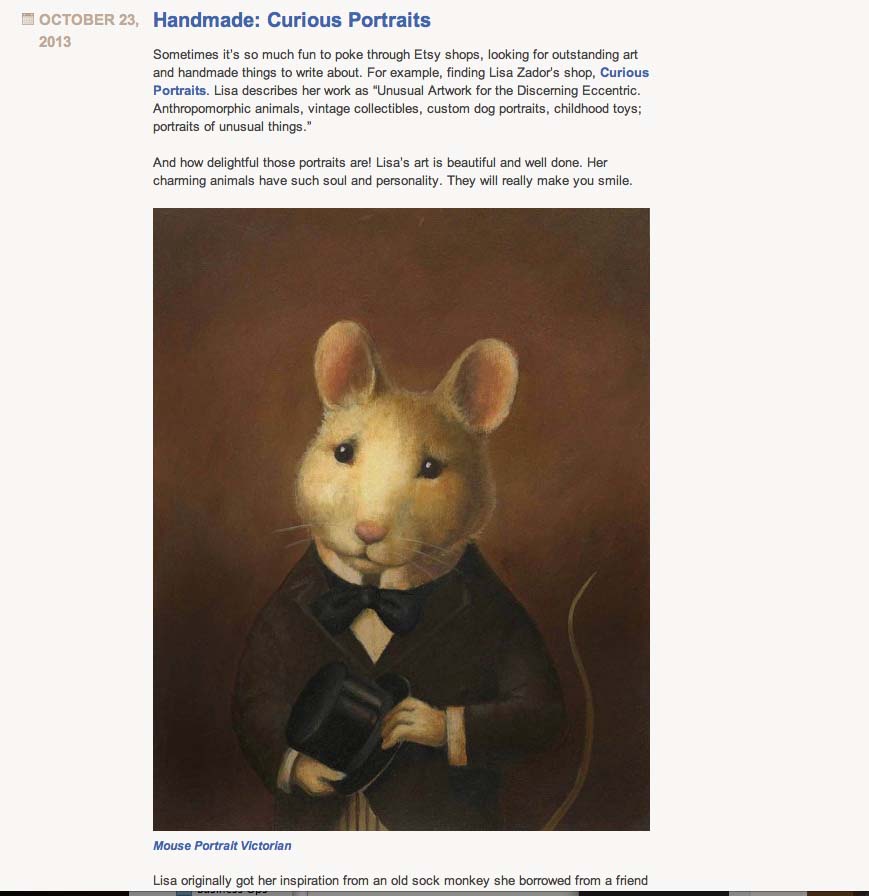
The first is by Evelyn Pelati, a talented jewelry designer who has a knack for finding interesting artists, craftsmen and designers to write about on her blog.  Just click the image to read more of her post about yours truly! You can see her beautiful jewelry on her website: evelynpelati.com

evelyn-petali-curious-portraits

The other one is called Papoose Clothing by Ashley Duggan Smith who makes the most adorable and charming children’s clothes. Just click the image to read more of this wonderful post. You can find her unique clothing line in her Etsy shop Papoose Clothing.

papoose clothing-curious portraits

Thank you Evelyn and Ashley for your very kind words about my work!


Uncle Omelette: Creepy Food Icon or Ideal Husband?

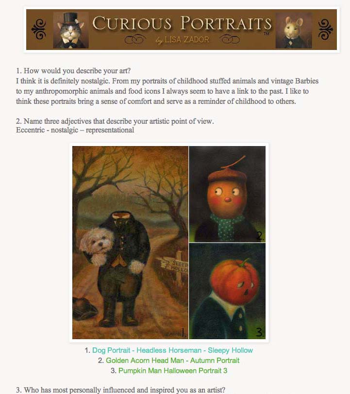
I just finished this painting and thought I ought to do a post about it. Apparently Uncle Omelette is frightening people (if my friends reactions are any indication) and I am trying to understand why.  I suppose the somber colors and his inscrutable expression might be a factor. I admit that Anthropomorphic Food, one of my favorite subjects, can be a little creepy to some. I thought that telling the story of how the portrait came about would perhaps make the subject seem a little more friendly.

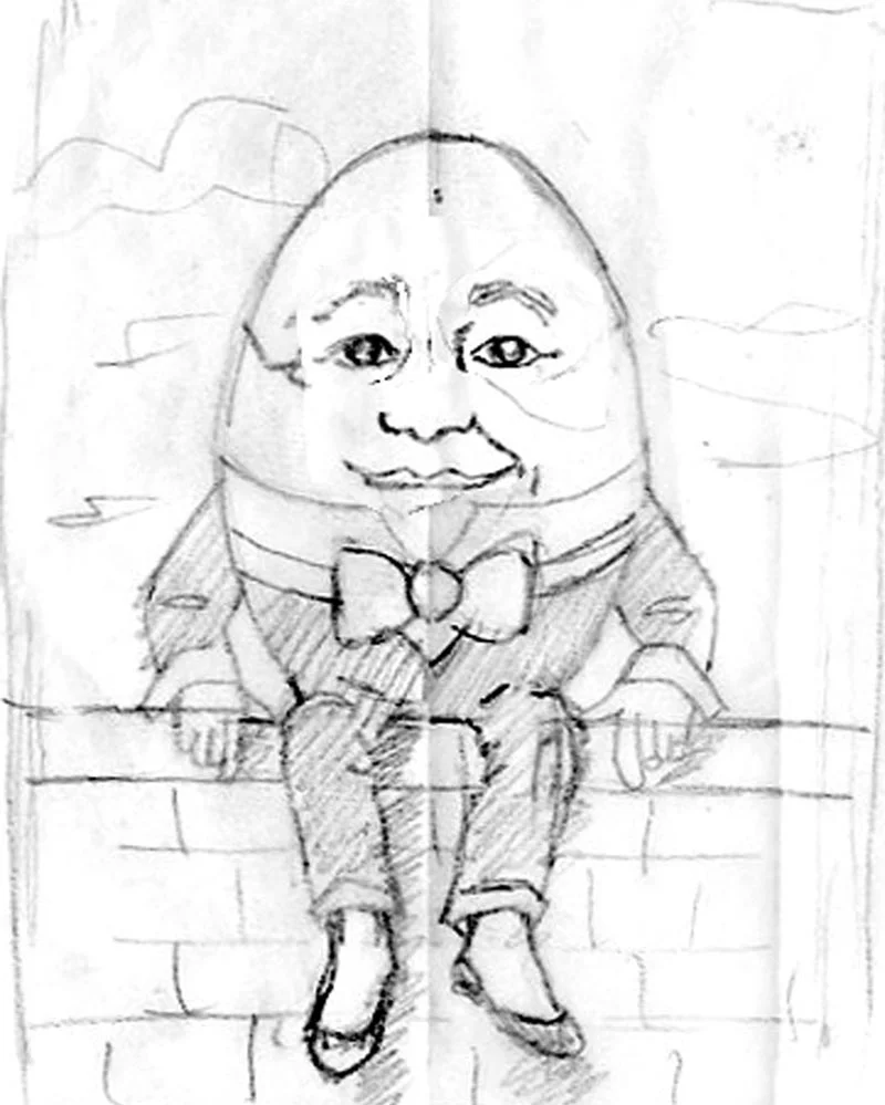
Originally this was going to be a portrait of Humpty Dumpty who seemed the perfect subject to be included in my series of anthropomorphic food icons.

Uncle Omelette-finished painting. Lisa Zador
Humpty Dumty sketch. Lisa Zador

One night during a bout of insomnia (when many of my best painting concepts appear) I had the idea that he shouldn't be sitting on a wall, as he is often portrayed,  but should be shown doing something domestic, to sort of show  Humpty Dummpty "at home".  It occurred to me that it would be funny if he was cooking bacon since he is after all, an egg. The painting then evolved into the second sketch. I was even going to paint him in bright, vintage kitchen colors with a pistachio green wall and vintage pot holders hanging in the background.

Uncle Omelette Sketches. Lisa Zador

I began the painting as I always do with a grisaille underpainting using brown and white to block in the light and shadow.

At this point I became distracted with other projects and put the painting aside for about two months.  A week or so ago I decided it was time to work on it again. I know that sometimes when I let a painting sit too long I lose my train of thought. I felt strongly about this particular portrait and thought it deserved to be finished. I began to add in glazes of color and it became clear to me that all the background elements were unnecessary. The slightly green background  against the burgundy shade of his suit felt almost flemish to me. I found the contrast of this formal painting style with the absurd subject matter very exciting. I knew that the painting was nearly finished.

Uncle Omelette Painting Stages 2. Lisa Zador

When I look at Uncle Omelette I see a kind, caring face. The fact that I named him "Uncle" (something that again came to me during a sleepless night) made him seem immediately familiar.  Cooking for someone, in my opinion is a very caring act; in my family it is the best way to show people you love them.  So in my imagination, Uncle Omelette is a benevolent and loving family member who is trying to take care of me.

Uncle Omelette-finished painting. Lisa Zador

That being said I must also add in that according to my friend Danielle, because I am often attracted to bald men and am always saying that I would love a chef as a partner, this is actually a portrait of my ideal husband.  I may like her interpretation the best!

New ACEO Prints at Curious Portraits

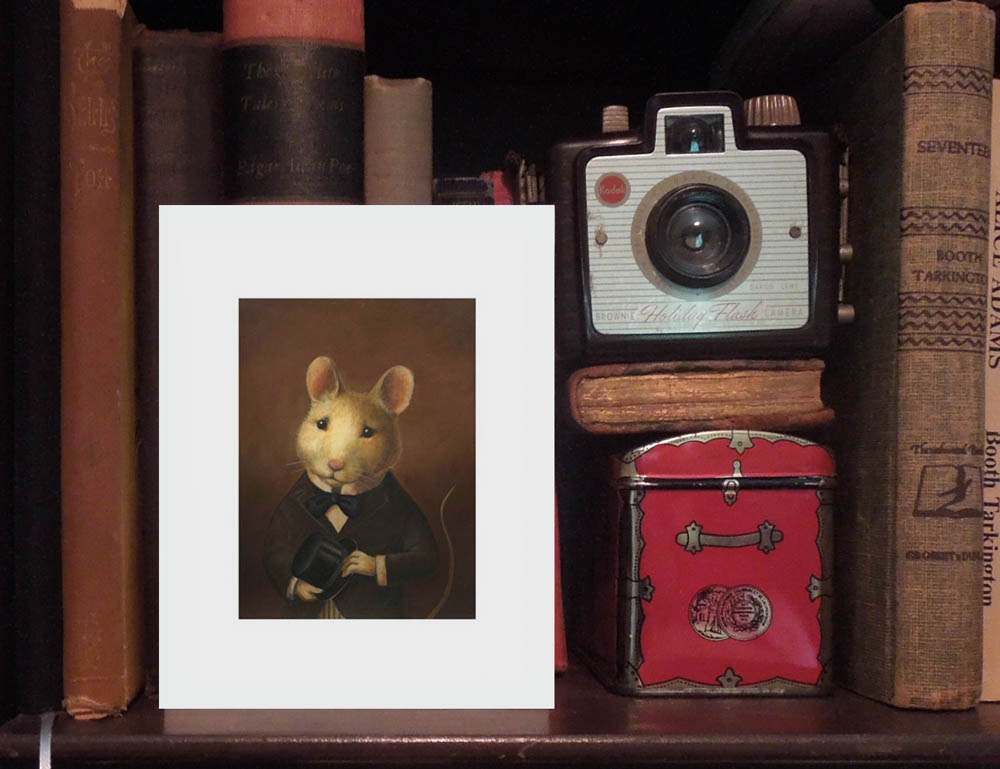
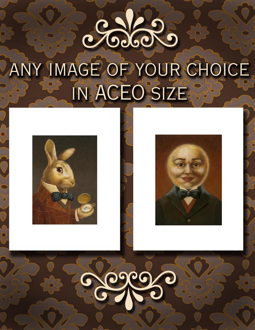
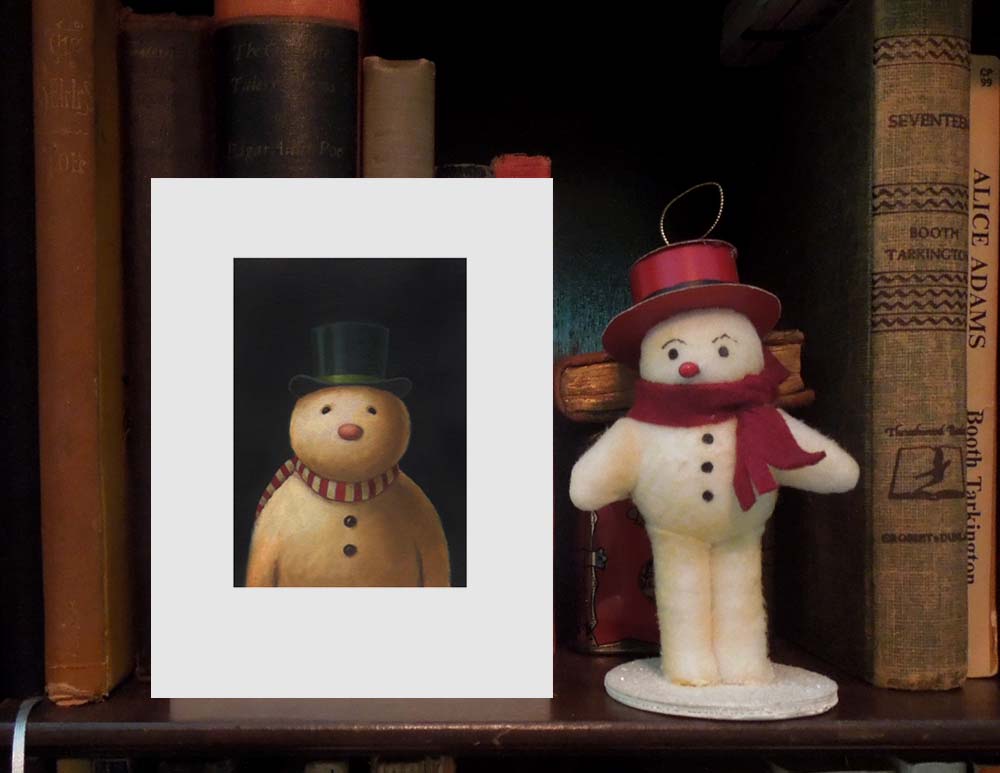
curiousportraits.etsy.com For awhile now I have been hearing about and running across the acronym ACEO regarding artwork and prints. After some investigation I discovered that it stands for Art Cards, Editions and Originals and has become a hugely popular way for people to collect and trade miniature artwork and prints. The only criterion seems to be that they must adhere to a standard size of 2.5" x 3.5" ; the original size of baseball trading cards. Being extremely fond of anything miniature myself, I thought it would be the perfect way for me to offer less expensive editions of my artwork in my Curious Portraits shop on Etsy!  I spent last weekend experimenting with different ways of photographing the prints in a way that would show their unique, petite size. In the end I propped them up in my bookcase with some vintage books and a vintage camera which I thought would also convey the old fashioned, vintage feel of the prints and photographed them in natural light. So far I have only listed the most popular prints in this format but I'll be adding more every day. Meanwhile I have added a listing to the shop through which you can order just about any image in the shop as an ACEO.

www.curiousportraits.etsy.com

www.curiousportraits.etsy.com

The sudden cooler weather here in NY inspired me to begin listing some of my Christmas Portraits too!

www.curiousportraits.etsy.com

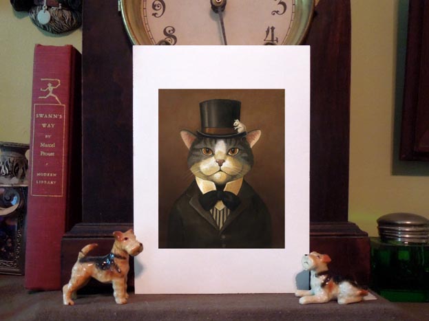
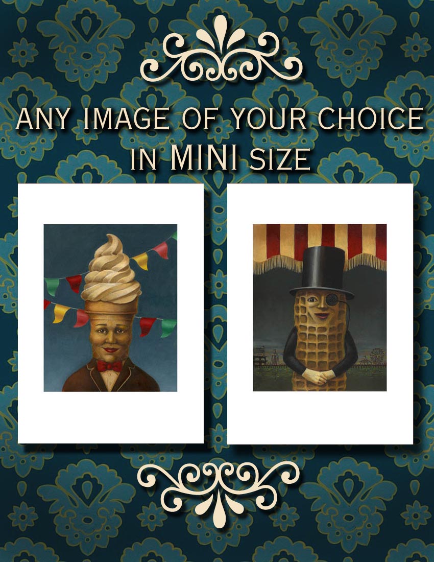
I also decided to finally list some MINI prints in the shop that are slightly larger than the ACEO prints . They are 3.5" x 4.5"  and printed on 5" x 7" paper ready to pop right into a standard frame. I always get requests for framed prints so I will soon be offering this size print already framed and ready for gift giving. I got to use some of my favorite mini dog statues and my mantle clock for these photos.  I have also added a general listing for this size print to use until I get all the separate listings up.

www.curiousportraits.etsy.com