Have a great end of the summer. Don't forget the ice cream.
You can read more about Mr Softee's portrait here.
Have a great end of the summer. Don't forget the ice cream.
You can read more about Mr Softee's portrait here.
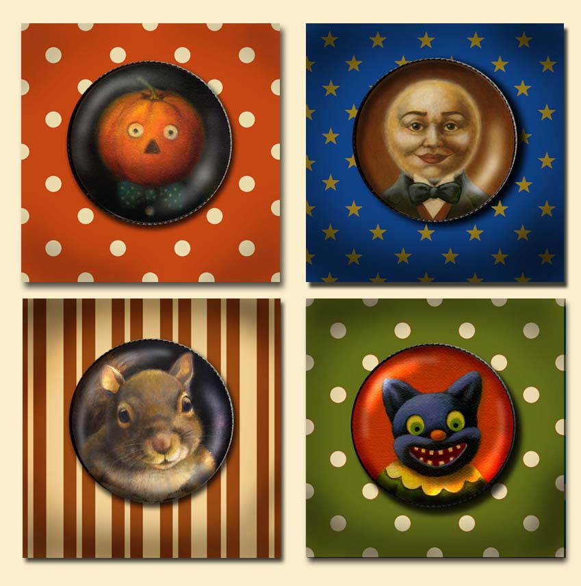
 I am always reading articles on Etsy's blog about having great photos for your listings. Since my items are all prints of my artwork I didn't think there was much I could do to improve them. A few weeks ago I had some extra time and decided to look over my shop with a critical eye. I realized that my jewelry listings were abominable! When I first began to carry jewelry I was so overwhelmed with all the details of finding the proper supplies, deciding how to package them in an appealing way, and how to photograph them properly. I found that it was very difficult to get a good clear photo (with the camera I had at the time). I did however want to get them up and running to see how they would do, intending to polish the listings up later so I just photographed them all against a soft blue suede background. Two years later I realize that they continue to sell well despite the terrible photos so I thought it was about time to do some polishing! I decided to put cheery backgrounds behind them in polka dots, stripes and damasks that I thought helped to convey the feeling of the image. With a little help from Photoshop (and my new camera which I love, a simple point and shoot Nikon Coolpix S8200 ). It has a terrific wide angle that allows super close up shots and in just about every setting allows you to adjust the color balance and light exposure which is important especially when you don't use a flash. It was so much fun putting in the backgrounds and seeing them come to life. The good news is that with these new flashy listings sales have definitely gone up so I am grateful to Etsy for all those inspiring and motivational articles ! I have included a sample of the before and after of my Christmas Elf Squirrel so you can see the difference.
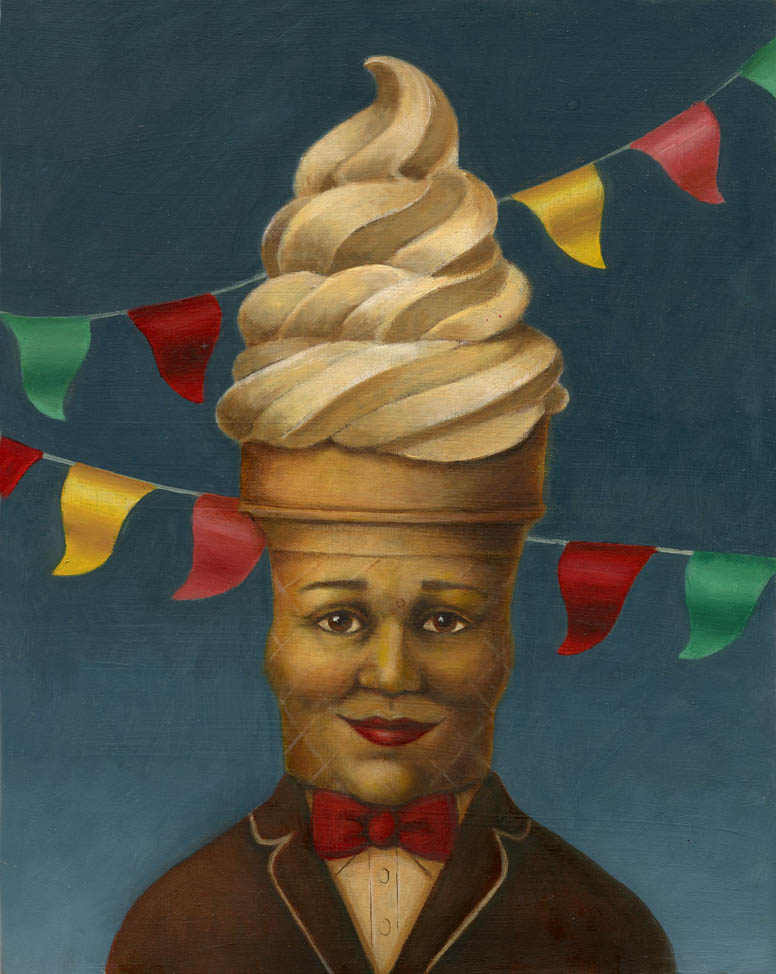
 I am happy to say that my Mr. Peanut portrait now has a new anthropomorphic food companion in the form of Mr Softee! When my sister, my cousins and I were kids Mr Softee held a special place in our hearts. We would hear that familiar tune playing on a hot summer day when the truck was still blocks away and be filled with such a longing for that smooth, cold ice cream. I still remember how much I resisted taking that first taste, knowing I would be ruining the perfectly formed swirl of creamy goodness. We were equally adoring of other swirly, soft ice creams such as the Twin Kissed variety found on the Wildwood boardwalk, only that one had vanilla AND chocolate swirled together in one which seemed like absolute magic! I don't know why these food icons, which were a popular type of advertising in the 1950's and 1960's continue to have such a powerful hold over me and and my artwork. I think there is something very profound about the personification of inanimate objects and animals especially to children. I know that believing my teddy bears had feelings and personalities gave me a great sense of comfort and security. Now as an adult I still feel cheery when I see my salt and pepper shaker faces looking up at me from my kitchen table at breakfast!